Political campaign design is a tricky thing; there are a lot of limitations ( “What shade of red, white & blue do you like, sir?” ) and a wide array of things to convey over a wide range of media ( yard signs anyone? ).
Politics aside, the Obama logo was the most memorable as of late. The patriotic colors, the sun rising, hope, a new day… it was all there. Genius.
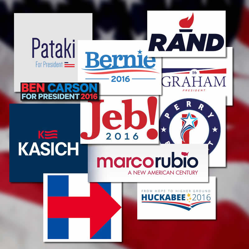
Sadly, none of these really come very close to that. I like the Rand logo; very iconic. I look at Hillary’s logo and wonder if the intention to make the arrow point to the right was a conscious one.
Politico took some of the most talented designers ( *DAVID CARSON* ) around and asked their opinions on the best and the worst. Opinions were varied with one person’s best being another’s worst.
Maybe that’s something to take into account when designing your own logo.