The trend towards Responsive Design has been going for a while now, but there’s a good chance that term means absolutely nothing to you. What is Responsive Design and why should you use it when building your website? Hopefully by the time you are finished reading this, you’ll have a good general handle on the concept.
What is it?
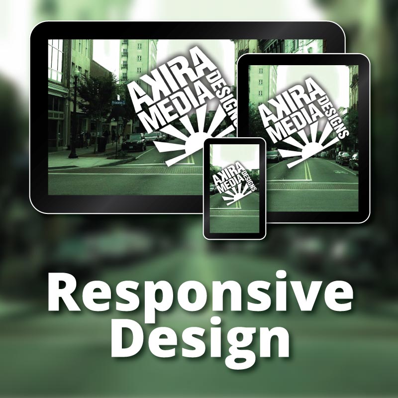
Put simply, Responsive Design is the concept of building a website that displays well and is usable on a wide variety of devices. There are a few somewhat complicated technical concepts behind it, but it boils down to a single website that tailors its appearance depending on the size of the screen it is being viewed on.
Why would you do that?
There are a lot of reasons, but let’s just tackle the main ones here in a scan-the-page friendly bulleted list:
- More People Use Their Phones to Access the Internet
Mobile usage outpaced desktop usage for the first time last year. While a majority of that usage was spent in apps (Facebook anyone?), a good chunk was in browser surfing the net. - Better Usability on Mobile
If you’ve ever been to the desktop version of a website on your phone, you know that it can be a major pain to have to pinch and scroll around to find what you want. Responsive Design takes device size into account and presents a different navigation. - One URL to Rule Them All
Some sites have a separate mobile version that they forward mobile visitors to. An example of this is visiting a url like www.yoursite.com and it kicking you over to a mobile version on m.yoursite.com or yoursite.com/mobile. If you try to visit these mobile versions on a desktop they don’t always redirect you to the regular site or if they do, they just push you to the homepage and not the desktop version of what you were looking at. Then you have to go and find it and then that’s a major pain as well. - SEO Advantages
Google will give your site a boost in mobile search results if they look at your site and determine it is mobile friendly.
Many DIY website builders automatically generate a responsive sites and more and more CMS templates are being built this way as well. If you have any potential customers that use the Internet on their phones, I really recommend this as the way to go. Restaurants, Specialty Shops — any local business can use this as a tool to help them fight the Amazons and Wal-Marts online because Lord knows, we need all the advantages we can get.
Sales Pitch ( You knew it was coming… )
Maybe your website is a little out of date. Now would be a great time to refresh it and make it mobile-friendly and modern. What are you waiting for? Give me a call today. I’m low pressure and will work with the budget you have.